Support Forum
Similar to #138917 Main Menu on mobile not visible because of logo

ISSUE SUMMARY:
PLEASE MAKE CORRECTIONS TO THE TEST SITE AND LET ME KNOW WHAT CHANGES YOU MADE PLEASE. I see where you fixed the same issue with another user but did not say what you did. Please detail the change so I can make it on the production site when I have permission to do that. Thank you.
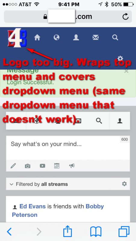
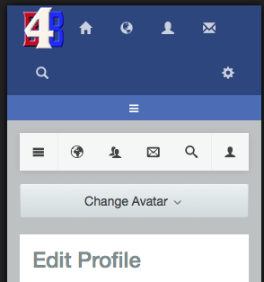
See attached pics.....
logo (even "SMALL" logo on mobile) is too large. wraps top menu down one line and hides drop down Main menu.
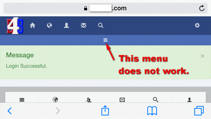
ALSO.....this drop down main menu DOES NOT WORK.
STEPS TO REPLICATE:
1view site with IOS mobile phone in VERTICAL postion....can't see main menu icon
2
3 view site with IOS mobile in HORIZONAL position....can see main menu icon but DOES NOT WORK.
4
5
RESULT
EXPECTED RESULT
BROWSER Safari IOS
NOTE: Your recommendations for changing the custom.css file with max width settings ONLY SEEMS TO AFFECT THE DESKTOP VIEW, NOT THE "SMALL LOGO" VIEW FOR MOBILE.....unless I am doing something wrong. It does affect the desktop but I can't find the same code for the mobile "small logo" view.
Hi,
please put this CSS at /templates/socialize/css/custom.css (please create that file if not exist)
@media screen and (max-width: 353px) {
    button.toggle-no-header {
        margin-top: 50px;
    }
}
and I saw your site got javascript error:
/templates/socialize/js/profile_update.js
seem that your custom javascript code. and this module mod_people_suggest_r still bring jQuery 1.7 that will make many issue. jomsocial it self already bring jQuery 1.11. other modules no need to bring they own jQuery any more.
this is related with backend preview.
Regards
First, thank you for your support and finding the jquery issues. I am working on removing the additional/unneed loading.
I created the custom.css file and it DOES push the menu button down one line so it can be seen.......however it does not fix the two issue I have with the mobile template:
1) The main menu icon (that we can now see) still does not work. You can easily test this on any IOS phone. I have not yet removed the loading of jquery 1.7....but are you certain this is the cause of the menu not working or is it some template config problem or some other issue with the template? HOW CAN I GET THE MENU ICON TO WORK?
2) The display of the logo on the mobile (small/extra-small) template is too large and forces the menu to wrap down to the next line. I have seen pictures of the mobile template working correctly, with the correct size "small logo" and everything on one line. However, for some reason no matter what size I make the logo (even 16px by 16px) the template still displays the logo TOO BIG and wraps the menu down to the next line. HOW DO I REDUCE THE SIZE OF THE "SMALL MOBILE LOGO" so it will not wrap the menu?
Thanks again for all your help and quick response.
Hi,
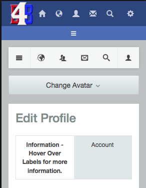
please clear your browser cache and joomla cache. the CSS it work:
if you want to make the menu icon in one line, please use this CSS and remove my CSS code (prev post)
@media (max-width: 767px) {
  .t3-community-toolbar .nav-pills li > a {
    padding: 15px 9px;
  }
}
so the result is like this:
and about mobile menu expand issue. that issue from CSS conflict. please try to remoce jQuery 1.7 first. if the issue still exist. please edit your first post and put super user at site info section (private). I need to find the trouble maker modules.
Regards
Hi,
FYI:
my CSS only for mobile view, thats why I use max with.
www.w3schools.com/cssref/css3_pr_mediaquery.asp
Regards