Support Forum
Make mainnav
ISSUE SUMMARY:
Hi,
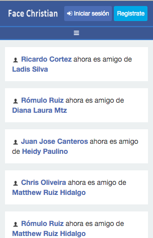
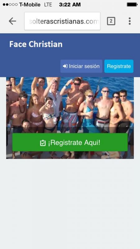
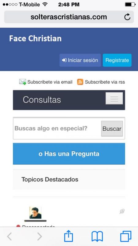
I need help changing the size of mainnav, look to wider mostly on mobile devices, is not possible to open the menu, please check the screen shot
STEPS TO REPLICATE:
1
2
3
4
5
RESULT
EXPECTED RESULT
BROWSER
-

- Dimas
- Visitor
- Thank you received: 0
Licenses:
Hi Romulo,
I cant see your screenshoot here, can you post it again, please?
thank you
-
- Dimas
- Visitor
- Thank you received: 0
Licenses:
Hi,
You can edit this file templates/socialize/css/template.css, find this code :
@media (max-width: 767px) {
  .navbar-brand img {
    max-width: 180px;
  }
}
then change it to :
@media (max-width: 767px) {
  .navbar-brand img {
    max-width: 120px;
  }
}
or change to the smaller width
thank you
-
- Dimas
- Visitor
- Thank you received: 0
Licenses:
I think that is cache, the width still same, dont forget to add important tag for making sure it works :
@media (max-width: 767px) {
  .navbar-brand img {
    max-width: 120px !important;
  }
}
Hi Dimas,
now i know where is the issue, if i remove the logo in module: Community Toolbar for Socialize Template, then the size is ok, but it's not suppose to do that, because there are an option: logo icon for mobile, even if i add logo icon for mobile is not shown, please check that.
-
- Dimas
- Visitor
- Thank you received: 0
Licenses:
How did you remove the logo? via CSS or ? I suggest you follow my trick above it can be a solution, I already tried it via chrome dev tools
Hi Dimas,
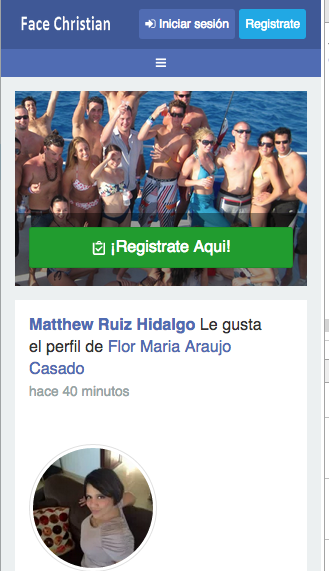
Sorry for bother again with the same issue, well i update to the last socialize template, and i'm having the same issue, i did what you set to do, but no change, remember at the end of this previous ticket, i asked for what you did, to solved, so please help.
Best Regards
Romulo Ruiz