Support Forum
Mobile Logo Size?
ISSUE SUMMARY:
My mobile logo is to big for mobile and messes up the alignment of the notifications. What size should the logo be?
STEPS TO REPLICATE:
1
2
3
4
5
RESULT
EXPECTED RESULT
BROWSER
-

- Dimas
- Visitor
- Thank you received: 0
Licenses:
Hi Michelle,
Which logo do you mean? please provide me the screenshoot..so I can inspect it
thank you
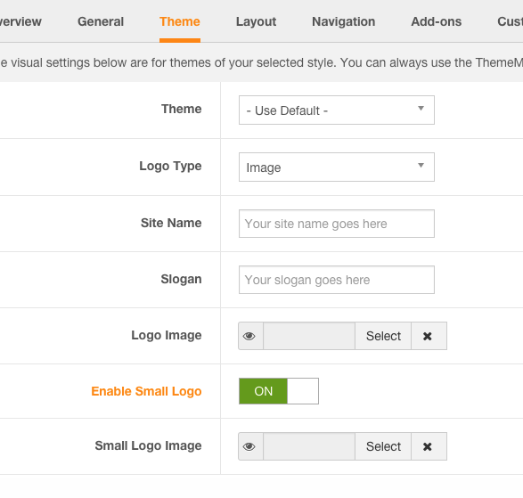
I don't like to publicize my website on here so please no screenshots unless it's in a private message. I posted in the socialize template forum and my subject is mobile logo...so obviously it's the logo for the mobile version of socialize template....I don't know what other info you would need. Is there a size for the logo??
-
- Dimas
- Visitor
- Thank you received: 0
Licenses:
The width of max-size for mobile is 180px
I uploaded a logo 180x67px and my mobile logo still pushes the login and signup button below the logo instead of next to the logo as in your demo. How do I fix this? This causes my main menu to be inaccessible. I added the "small" logo to both the template and the toolbar module. (please see the test site)
-
- Dimas
- Visitor
- Thank you received: 0
Licenses:
Hi Michele,
Please provide me the screenshoot what do you get there? and what do you want looks like. Maybe i can help with some css code
thank you
You have access to my website! I told you to look at my "test site" to see the issue, so I don't no why you guys request this personal information and then reply back with screenshot request when you have access to the live issue!! ....I'm confused here??? Now another day is wasted and now it's the weekend so I guess that means 3 days wasted!! I don't have a screenshot tool so please just visit the test site on a mobile phone to see the issue. I would like my mobile header to look like the socialize mobile header with the logo and the login/signup buttons next to it, not below it as in my case. I don't want my website publicized on here so I wouldn't post a screenshot anyway.
Thank you
-
- Paul
- Visitor
- Thank you received: 0
Licenses:
Hi Michelle,
Socialize has the logo img set as a max width so it will fill to that setting
.navbar-brand img {
  max-width: 180px;
}
If you create a file in your templates css folder called custom.css and put this code into it you will see that it doesn't wrap the menus below on a mobile. You can adjust the max-width to what ever you like
.navbar-brand img {
  max-width: 140px;
}