Support Forum
Mobile view show comments

HI, Lee.
Thank you for contacting us.
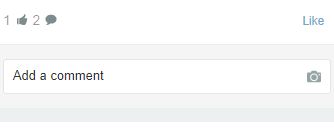
I'm not sure what the issue you're reporting... but when you click on comment icon, comments are displayed in modal window like this:
prntscr.com/hpfhcu
- Instead of saying: 'it's not working', explain the problem in detail.
- Screenshots with the URL visible in them and the problem marked are more than welcome.
- Tell us how to replicate the problem, we can't fix it if we can't find it.
- Make sure that your site/server meets JomSocial System Requirements
- Make sure to setup JomSocial Cron Job
- Always provide us with access details to the backend and ftp. We need it to debug problems.
- If you have a similar problem, but a solution you found isn't working, open a new thread instead of 'merging' with an existing one.
- Use the "Thank You" feature on any post that helped you
HI, Lee.
No, this is by design to make stream shorter. Not in all cases users want to read comments - just quick peek on activities.
So sorry but this can't be changed easily... only by customization.
- Instead of saying: 'it's not working', explain the problem in detail.
- Screenshots with the URL visible in them and the problem marked are more than welcome.
- Tell us how to replicate the problem, we can't fix it if we can't find it.
- Make sure that your site/server meets JomSocial System Requirements
- Make sure to setup JomSocial Cron Job
- Always provide us with access details to the backend and ftp. We need it to debug problems.
- If you have a similar problem, but a solution you found isn't working, open a new thread instead of 'merging' with an existing one.
- Use the "Thank You" feature on any post that helped you
ok, so although I understand that jomsocial "users" in your opinion do not want this feature, I think it would be a better user experience. To have option to display comments in another way would be really cool
But we can all have our opinions...
So, I would like to learn how to do this.
Could you help please?
HI, Lee.
I'm sorry but I can't provide you complete instructions how to customize that part.
As much as I'd love to help, customizations are beyond what we're able to do for customers... what we mentioned in our Support Policy:
www.jomsocial.com/support-policy
But I'll pass your feedback to our Project Manager to let him know.
You may also start a discussion in our Community.
- Instead of saying: 'it's not working', explain the problem in detail.
- Screenshots with the URL visible in them and the problem marked are more than welcome.
- Tell us how to replicate the problem, we can't fix it if we can't find it.
- Make sure that your site/server meets JomSocial System Requirements
- Make sure to setup JomSocial Cron Job
- Always provide us with access details to the backend and ftp. We need it to debug problems.
- If you have a similar problem, but a solution you found isn't working, open a new thread instead of 'merging' with an existing one.
- Use the "Thank You" feature on any post that helped you
Ok, well could I ask you how to make the comment icon slightly bigger? People with small fingers cannot open the comments and some of them often complain to me that they click other links that they do not want to click in mobile view, maybe I should respond in pretty much the way you have responded to me? Oh wait, that would be negative wouldn't it? ;-)
HI, Lee.
C'mon, what was negative in my answer? That this is per design or that we do not support customization? :)
As far I recall, you're first user that rise this issue :)
Yes, you may make it bigger. Try this:
.jomsocial .joms-stream__status--mobile .joms-icon {
width: 30px;
}

.jomsocial .joms-stream__status--mobile a {
font-size: 20px;
}
I agree that icons in mobile view should be bigger - in nowadays site are viewed in mobile devices much much often. Those icons should be more big-fingered user friendly ;)
- Instead of saying: 'it's not working', explain the problem in detail.
- Screenshots with the URL visible in them and the problem marked are more than welcome.
- Tell us how to replicate the problem, we can't fix it if we can't find it.
- Make sure that your site/server meets JomSocial System Requirements
- Make sure to setup JomSocial Cron Job
- Always provide us with access details to the backend and ftp. We need it to debug problems.
- If you have a similar problem, but a solution you found isn't working, open a new thread instead of 'merging' with an existing one.
- Use the "Thank You" feature on any post that helped you
You are right, your reply was not negative, it just started with no :-)
How I enjoy our little brawls! hahaha!
Thanks for the code snippet, I will try to implement it this evening when my gf gives me some free time!
HI, Lee.
:)
Yes, try it and let me know if it works for you. As I said, I agree that they should be a bit bigger and I reported that to our developers.
- Instead of saying: 'it's not working', explain the problem in detail.
- Screenshots with the URL visible in them and the problem marked are more than welcome.
- Tell us how to replicate the problem, we can't fix it if we can't find it.
- Make sure that your site/server meets JomSocial System Requirements
- Make sure to setup JomSocial Cron Job
- Always provide us with access details to the backend and ftp. We need it to debug problems.
- If you have a similar problem, but a solution you found isn't working, open a new thread instead of 'merging' with an existing one.
- Use the "Thank You" feature on any post that helped you
Good suggestion to display 1 comment and BIG link-button “show previous message” like on mobile landscape.
Pop up window take too much time to load in mobile portrait view. For me it’s easy to rotate my phone and read it instantly in landscape view.
Sorry for my English
HI.
Thank you guys for your feedback. I'll pass them to our Project Lead.
- Instead of saying: 'it's not working', explain the problem in detail.
- Screenshots with the URL visible in them and the problem marked are more than welcome.
- Tell us how to replicate the problem, we can't fix it if we can't find it.
- Make sure that your site/server meets JomSocial System Requirements
- Make sure to setup JomSocial Cron Job
- Always provide us with access details to the backend and ftp. We need it to debug problems.
- If you have a similar problem, but a solution you found isn't working, open a new thread instead of 'merging' with an existing one.
- Use the "Thank You" feature on any post that helped you
HI, Lee.
Yes, always in the same file:
ROOT/templates/socialize/css/custom.css (if you don't have this file - feel free to create it)
- Instead of saying: 'it's not working', explain the problem in detail.
- Screenshots with the URL visible in them and the problem marked are more than welcome.
- Tell us how to replicate the problem, we can't fix it if we can't find it.
- Make sure that your site/server meets JomSocial System Requirements
- Make sure to setup JomSocial Cron Job
- Always provide us with access details to the backend and ftp. We need it to debug problems.
- If you have a similar problem, but a solution you found isn't working, open a new thread instead of 'merging' with an existing one.
- Use the "Thank You" feature on any post that helped you