Improvements to Mobile interface

I have a few comments to make about Mobile!
Firstly I would like to say the Mobile interface is much improved. However, I have some suggestions that I am hoping will help you improve the interface further......
I feel there is still too much on the screen, and that some items aren't important when you are using Mobile. The screen could be 'cleaned up' further if you hide some things.
1) You haven't utilised the Jomsocial Menu fully. (see picture Jomsocial Menu2) Because you haven't got dropdowns for Groups and Events on that Menu, you have put an extra Menu on the Groups page and Events page for them.
Suggestion: You could put 'All Groups, My Groups, Pending Invitations' as dropdown items for Groups on the Menu, and All Events, My Events etc as dropdown items for Events. That would allow you to remove the Menu button for them on the group page.
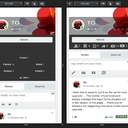
2) Groups - If I go into a Group, I was hoping that I would see the top of the Activity Stream without scrolling, and that I would see less space taken up with lists....At the moment the Activities etc are hidden below the fold.
See picture 'Group Page' -
Suggestions: Remove Invite Friends:- Invite Friends currently has its own button on the Mobile screen, although this could be done from the Options menu already. Also, you don't invite friends every time you go to a group so it isn't very important. You do want to see Activities every visit - so they are more important.
So the button space of 'Invite Friends' isn't being maximised. I suggest putting a Menu button there instead, and that menu could have Discussions, Photos, Events, Members, Activities on it and be called 'More'. It will save a lot of space on the screen if those items are accessed by a Menu button
[When I go to Discussions, these items are on a Menu in that place 'More' already]
3) Often you have to scroll down the screen to see something - I think should be seen without scrolling. For instance, if I look at a group in the group list or an Event in the event list I can't see the whole entry on the screen! An Event in the event list needs to show on one screen without scrolling as it will look much better.
(See photo called grouplist)
Suggestion you can save space on the list entry for a group by putting a simple Menu button that people can click if they want to choose Members, Discussions, Events, Photos etc. This can be called More. This will reduce the amount of space needed for each Group record in the list.
Suggestion - Label saying 'Public' or 'private' can be moved up and put just after the group name to save space
4) When you Search for a Group - a lot of space is wasted here and so you can't see the whole group cover. See 2 photos 'Group Search' and 'SearchGroupResults'
As discussed, you don't need the extra Menu that you have here, because the items could be put on the main Menu as dropdowns 'All Groups, My Groups etc'.
'Most Active' and 'Category' boxes are taking up a lot of space and could be side by side.
5) If I am in a Group and I choose Discussions or Events etc, then after I have looked at those it is not obvious how to get back to the Group Home page/Activity Stream. (I do that personally by clicking on the Group Name on the Group cover, but I know my users won't do that!) Can I suggest that you add Activities to the list 'Members, Photos, Events, Discussions, More' Menu/list, so that you can always return to Activities easily.
6) If I go to Events and start to look through the list, it would be good if one Event fitted on the screen without needing to scroll. At the moment one record is longer than the screen, which is untidy. see picture Event
Replies
Susan
Ok this is really annoying - my comment is obviously too long for the box, but instead of telling me that, the comment just disappears when I hit return. It has happened twice! What is happening? Is this a bug?
10 years ago

Susan
I'll write this as several comments! Thanks for the fast feedback. Please can you let me know which items on the list we can deal with without hacks? But wouldn't it be better if Jomsocial 'out of the box' fit properly on a Mobile screen, rather than us having to customise it, as that is a hassle for site owners?
10 years ago
Susan
I would have hoped you would START with a Mobile screen and have nothing on the new interface that didn't fit well on Mobile. If it means less shows on the Desktop version, then that is better than the Mobile version being crowded. The global trend is everyone does everything on phones, so if it doesn't look good on the phone it shouldn't be on there!! We don't have much time to spend on testing the...
Show more
10 years ago